

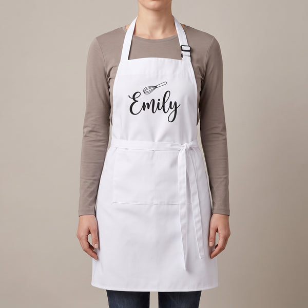
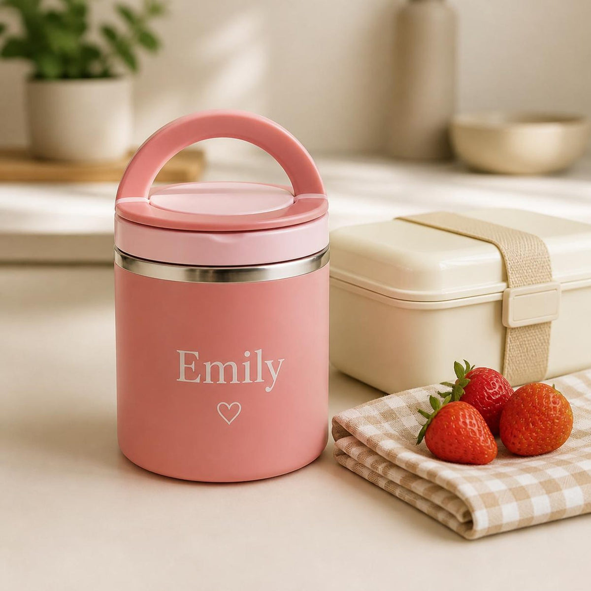
Most personalisation complaints are not about spelling; they are about a colour that looked lovely on the screen and disappeared on the object. A pale pink name on a pink food jar, a yellow line on a white apron, a navy monogram on a black jewellery box. Every one of those was chosen with care and printed exactly as chosen. This is the short guide to not doing it, product by product.
The one rule
Contrast beats taste. The text has to be much lighter or much darker than the surface it sits on, and "much" means more than you think, because a phone screen is backlit and a mug is not. The two-second test: squint at the product page with your chosen colour in mind. If the name would blur into the background when your eyes are half closed, it will blur into the background across a kitchen.
Why we cannot print white (and where we can)
Sublimation prints colour into a white or pale surface, but it cannot print white itself: the white you see is the product showing through. That is why the black apron takes a light text colour and the white one takes a dark colour, and why a "white" design on a black sublimated product is not possible. On products with an applied name, such as the food jar and the bento box, white text is possible and is the default, because on a pink, blue or green body it is the colour with the most contrast.
Product by product
| Surface | Products | Choose | Avoid |
|---|---|---|---|
| White | White apron, kids apron, mug, mouse pad, magnets, bottle wrap, 40oz | Black, navy, deep green, terracotta, plum | Yellow, pale pink, light grey, pastels |
| Black | Black apron, jewellery box lid | White-ish is not possible on the apron; use gold-yellow, light pink, sky blue, cream on the box | Navy, dark green, burgundy |
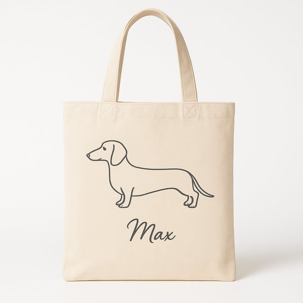
| Natural beige canvas | Makeup bag (beige), pet tote, tote set | Black, deep brown, terracotta, navy | Cream, tan, pale yellow |
| Kraft brown | Notebook | Black, deep green, navy | Anything pale |
| Coloured body | Food jar (pink, blue, green), bento (green) | White (default), then black | A colour close to the body colour |
| Clear glass | Iced coffee glass, acrylic sign | One strong colour: black, white, terracotta | Pale colours, gradients |
| Wood | Wooden coaster, heart magnet | Black, deep colours | Yellow, orange, light brown |
Photos next to text
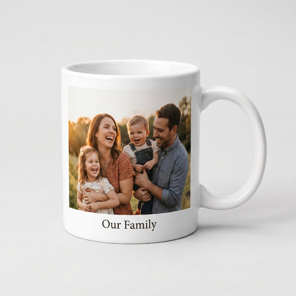
When a name sits next to a photo on a mug or a mouse pad, take the text colour from the photo (the jumper, the sea) and keep it dark enough to read on white. A colour that appears in the photo always looks intended.
The preview on the page
The personalisation box shows your text in your chosen colour as you type, and when a colour is too close to the surface the preview shows it on a dark patch so you can still read it; that patch is the warning. If your preview needed the patch, change the colour. The font guide covers the other half of legibility, and we check every order before printing and email if a colour will not read; that is the safety net, not the plan.
Everything is printed to order in Cheshire, usually dispatched within one to three working days, with free UK delivery. Because a colour choice is printed exactly as made, it cannot be returned for a different colour, which is the whole reason for this page.
Frequently asked questions
Why can't I have white text on a black apron?
Sublimation prints colour into a light surface and cannot print white; the white you see on products is the material itself. On a black apron choose a light colour such as gold-yellow, light pink or sky blue instead.
What text colour works best on a white product?
Black, navy, deep green, terracotta or plum. Pale colours such as yellow, light pink and light grey vanish on white from across a room.
Why is white the default colour on the food jar and bento box?
Their names are applied rather than sublimated, so white is possible, and on a pink, blue or green body it has the most contrast.


